Thursday, May 5, 2016
Wednesday, May 4, 2016
Sattelite View Media Screens and more Real Estate
It was brought to our attention several times that there were a couple improvements we could make regarding the way space was being taken care of on Building lit - Buildinglit.com. So we recently implemented some major improvements.
Now there is just more space on the page we took out the second toolbar that was getting in the way so all devices mobile and lower resolution have more screen to view our map.
Also we were told the satellite view was more professional looking. Take a look at the below image on start up.
 We noticed some very cool effects from this.
When you first look for a location you get a top down view of your search: See Empire State Building Search Below.

However if you zoom in even further. You get a real feel for what carriers and fiber are in your specific area because the camera rotates to a 45 degree angle for you to analyze better.
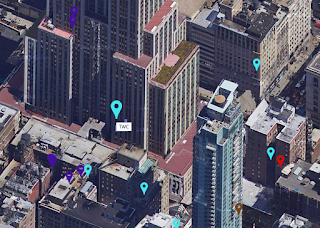
And you can rotate this as well too.
Now there is just more space on the page we took out the second toolbar that was getting in the way so all devices mobile and lower resolution have more screen to view our map.
Also we were told the satellite view was more professional looking. Take a look at the below image on start up.

When you first look for a location you get a top down view of your search: See Empire State Building Search Below.

However if you zoom in even further. You get a real feel for what carriers and fiber are in your specific area because the camera rotates to a 45 degree angle for you to analyze better.

And you can rotate this as well too.
Huge UI improvement with MouseOver

There have been several huge improvements added to Building Lit - Buildinglit.com in the past couple of weeks. The most notable is a huge improvement in the way the UI works.
Previously you had to rely on the zoom and toggle Pane to select the marker / carrier of your choice.
The reason for this was that some carriers had the exact same latitude and longitude and the markers would land directly on top of each other. To overcome this we had implemented a master image where the markers were in different locations. This worked you could see the different markers, however it bugged up the program in another way. The problem was some markers depending on which one landed first you could not select even though you could see them. The only way to select them was to toggle off the one getting in its way on top of it because there was transparent image data getting in the way of the one below it.
To overcome this we found a way to randomly nudge the markers left right up and down using random PHP math and adding it to the latitude and longitude data for each time. The result is none of the markers are directly on top of each other. This being the case we could instead of using a master image file use a dedicated image with the specific width and height of each marker. This allowed us to also incorporate animations so when you mouse over the markers now you know with precision exactly which one you have highlighted. As you can see in the image above the TWC marker around Disneyland is larger than the other ones because it is being hovered over. Happy hunting for carriers! This is a milestone for us because it was the last main hurdle in the UI and now the program works how it was originally envisioned!
Subscribe to:
Posts (Atom)